Tuesday, June 16, 2009

Project3 - Art Gallery

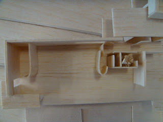
In this design, there is apartment and gallery on the same site. However, I would like to keep privacy for the dealer. Although Yayoi Kusama’s Exhibition space and dealer’s apartment are in the same level, the apartment is actually separated with exhibition space.

On the other hand, the office for dealer is semi-opened. Although visitors cannot see and get into it unless the dealer allowed, the dealer could see the main entrance and lower gallery while he work there.

In the ground floor, which included the main entrance and courtyard can be used to exhibit paintings and sculptures. Also there is back entrance in the courtyard, I made the outside grass in the courtyard interlock with interior floor which try to bring the exterior and interior together.

Since this gallery is made of interlocking boxes, I would like to add some fluidity into it. Circulation which included the dynamic angular main entrance and spiral staircase is the fluid element of the building.

Finally, the use of natural sunlight is significant in modern design. In this gallery, angular skylights which follow the entire circulation footpath give direct sunlight to the entrance and staircase. Furthermore, there are long and narrow windows in stock room and apartment which allow north sunlight get into these spaces.

Final Model

Facade


Roof + Skylight


Main Entrance - angular shape

View through the entrance

Spiral staircase


Courtyard with back entrance

1:100 Plans

There are plan interlockings.

1:100 Sections

There are sectional interlockings.

Room - 1:50 plan and section
Interior Perspectives
Precedent

Rosenthal Center for Contemporary ArtThere is an ‘Urban Carpet’ in the building which given the potential dynamism and density of the corner site. The main feature of the ‘Urban Carpet’ is it acts as interlocking structure of suspended gallery spaces.

Therefore, according to the RCCA, the interlocking spaces which also respond to Yayoi Kusama’s artworks, is the main idea for this gallery.


Artist

Yayoi KusamaShe is a Japanese contemporary artist. She has developed a highly personal formal vocabulary that combines repetitive elements such as net and dot patterns in gridded space. These enclosed spaces are the main exhibition space in the art gallery.


Site Analysis

This is a long and huge site which located at Newtown. The front face to the busy King Street, and the back is the quiet Camperdown Memorial Rest Park, also there is a car-park next to it.
1:500 Site Plan

1:500 Site Model


Site in Google Earth

Site in Google Maps

Tuesday, May 12, 2009

Project 2 - Room and Narrative

Final Model


sun light comes in from the big window in the exterior wall. The girl can get natural light when she is sewing in both open area and enclose area


lighting the staircase. natural light resource from the “big window”


the window is not only a window, but also a staircase. The girl can climb from the basement to top level straight away. This form a creative circulation.


A staircase around the whole room, and connect the entrance level and upper level. The exterior wall encloses part of the stair. Also there are thin windows on the exterior which allow light come into this dark area. Thus a mysterious atmosphere is formed.

Poche Drawings


Narrative

A tranquil mountain studio/cabana for a young, tender girl who keeps sewing clothing every day.

Inspiration

I was inspired by my project 1 building, Eileen Gray’s E-1027. One of the main features of the building is variety of circulation. There are three different stairs in the building for form either private or public circulation. Therefore, I would like to create a room with various types of stairs and various circulations in each level.


Painting

Title: Girl at Sewing Machine
Year was painted: 1921
Artist’s name: Edward Hopper
Size: 19 inches x 18 inches
Medium used: Oil on canvas

Understanding of painting:

This is a warm room in an apartment building with yellow brick exterior. The sun light comes in from the window. A young girl is sitting down in front of a sewing machine that focuses on sewing. Her body as attuned as her hands. Her feet, though not shown in the painting, are bound to be pudgy, are probably bare, pumping the treadle. She has tried to keep the fabric in perfect position, and concentrated in her work. The room is a bit messy with fabrics around it.

Wednesday, April 8, 2009

Project 1- Artifice

Eileen Gray – House E – 1027

The house is on French Riviera. There is a consideration about topographic condition. The slope falls away so that the living area is supported on pillars, while the two-story utility and bedroom area is firmly planted in the ground.


Poche


Parti

Structure

Showing the main load bearing walls and pillars which supporting the living area.


Circulation

There are three entrances in this house, so that the circulation is a bit complex. The main circulation is the spiral staircase. It lit from above, leads from the roof down into the servant’s room.


Enclosure

The north side of the house is enclosed by thick walls. However, the south-east side is glazed and can be opened on to terrace, sun and sea. Thus the south east side of the building can merge with the exterior area.


Program

The area which enclosed by thick lines are private area, and the rest of spaces are public area.


Geometry

The two circles form 45o